Judging City Paper and Life in Baltimore by 35 Years’s Worth of Each
by Lee Gardner (City Paper, March 28, 2012)
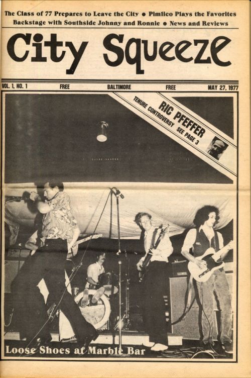
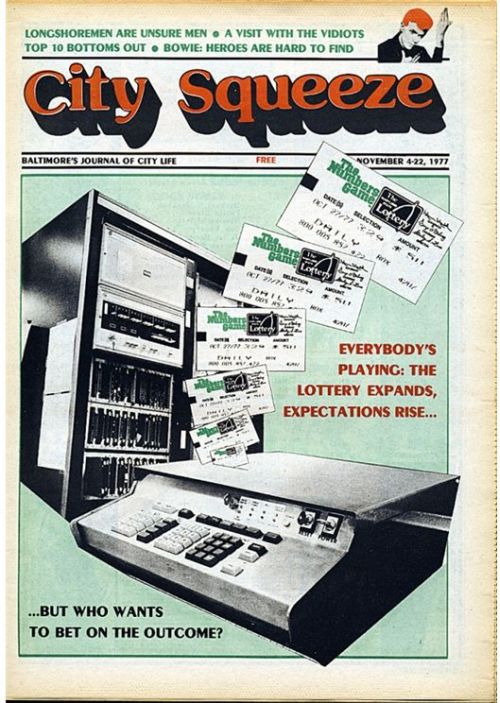
Perhaps the best tribute to a long-lived publication like City Paper would be a full-on Synecdoche, New York-style compendium of everything in every issue ever, all between one set of covers. (Or, you know, a complete run of 35 years’ worth of issues scanned in their entirety and available as PDFs online. Someday.) But flipping through old issues, it’s the covers that draw the eye. Each was (and remains) the print edition’s face to the world, announcing what the paper’s about, even if sometimes cryptically—the 1977 issue with nothing on the cover but a photograph of cheetahs stopped me cold mid-flip.
Thirty-five years of covers also serve as a sort of museum of publication design, as the black-and-white, blocky covers of CP’s earliest years gave way to spot color, then more elements, then fewer, then full color, then the telltale spidery fonts of early computer-assisted graphic design, and on up to the present. You can watch the elements ebb and flow: single images to multiple images and back, scant coverlines, as many coverlines as will fit, and everywhere in between.
Continue reading “What is an Alt-Weekly?” and view the cover gallery at City Paper.


